Click here to return to UX-Nick.com
Assess
objective
The goal of this usability test is to find out the strengths and weaknesses of the interface, layout, content presentation, and overall effectiveness of the Cue product website: www.cue.me.
testing format
The website, which sells a personal healthcare product, will be tested by various groups in selected coffee shops located around the peninsula. The shop should be decently well-populated , enough to accrue 5 participants in the study before too long. This testing methodology is known as “hallway” or “ambush” testing, where test subjects are not trained professionals and are rather members of the general public who could conceivably be users of the site.
So as to avoid bias, the test subjects will be asked at random according to their relative proximity to the test facilitator. The subjects should have a laptop already so that there is not an unfamiliarity with the testing platform and a state of relative familiarity in starting.
Define
testing areas
This test will cover the usability heuristics delineated by Jakob Nielsen in 1994:
- Visibility of System Status
- Match Between System and the Real World
- User Control and Freedom
- Consistency and Standards
- Error Prevention
- Recognition Rather Than Recall
- Flexibility and Efficiency of Use
- Aesthetic and Minimalist Design
- Help Users Recognize, Diagnose, and Recover from Errors
- Help and Documentation
These ten criteria will be covered in a series of questions and activities that help to assess the success of the site in achieving these Usability Heuristics.
pre-test procedure
Inform each participant of the reward they will receive for thoughtfully and completely involving themselves with the goals of the study. Gather a brief summary of who they are, background, light biographical information, gender and approximate age. If needed, a nondisclosure agreement can also be signed.
Capture
testing questions
Feedback and observations will happen during the course of each “test” as the participant moves through the requests and objectives. As compensation for their involvement in the test, all participants will receive a free Starbucks $5 gift card.
Diagnostic 1:
How does this site make you feel, and how do you like the look of it?
Diagnostic 2:
Does this website seem clear to you and relatively easy to understand?
The tasks were as follows:
- 1.
- What is the name of the product sold on this site?
- 2.
- How could you find out about what this product does?
- 3.
- What particular factors does the product examine and analyze to help its users?
- 4.
- How would you buy this product?
- 5.
- Are there questions or concerns about the layout and information on this website?
analysis
Respondents will be recorded and also observed, with notes and audio serving to record the tests and to later comprise data from which to make determinations about possible courses of action on the site. Roughly speaking, each test should take anywhere from 10 to 15 minutes, with a variability in the engagement and detail levels of answers provided by test subjects. When a suitable number of subjects have been tested, data compilation and analysis can begin.
Document
tester pool
Age Ranges
| Age range | Sample |
|---|---|
| 15-20 yrs. | 1 / 13 users |
| 20-30 yrs. | 5 / 13 users |
| 30-40 yrs. | 4 / 13 users |
| 40-50 yrs. | 0 / 13 users |
| 50-60 yrs. | 2 / 13 users |
| 60-70 yrs. | 1 / 13 users |
Professional Background
| Position / Industry | Sample |
|---|---|
| Technology sector | 4 / 13 users |
| Job seeker | 3 / 13 users |
| Student | 3 / 13 users |
| Healthcare | 1 / 13 users |
| Education | 1 / 13 users |
| Retired | 1 / 13 users |
User Quotations
Verbatim Comments
I think the out-of-focus foreground throws me a little bit...
I’m usually too impatient for video..if you are depending on me to watch the video or click down... something could exist right there on the first panel.
I see this thing...(subject points at Cue device in video still)...but I don’t know what the hell that thing is...
Does everyone have a different one ..and you edit it to the same card...or everyone is using their own...
(Regarding the interface) ... It keeps slipping..I’m trying to read what *that* [points at the bottom of the screen] says and it keeps rolling by...
Organize
test results
Initial Site Inspection
| User Experience | Frequency |
|---|---|
| Users who began watching the video without prompting: | 7 / 13 users |
| Users who attempted to stop watching the video during viewing: | 4 / 13 users |
| Users who found the “side-navigation” menu during initial site exam: | 2 / 13 users |
Site Impressions / Interface
| Outcome | Frequency |
|---|---|
| Users who liked the general look and color scheme of the site: | 13 / 13 users |
| Users who found the interface of the site easy to use and straightforward: | 5 / 13 users |
| Users who used the site with moderate degree of ease, but still had questions about navigation or struggled to get a product question answered: | 5 / 13 users |
| Users who used the site with high degree of expertise and had little to no remaining questions: | 2 / 13 users |
Compare
user outcomes
Product Understanding
| Outcome | Frequency |
|---|---|
| Users who were able to name the product and market segment in focus: | 13 / 13 users |
| Users who could name what the product does in low detail or could not tell what the product does: | 3 / 13 users |
| Users who could name what the product does in moderate detail: | 5 / 13 users |
| User who could name what the product does in high detail: | 5 / 13 users |
Moving Forward
| Outcome | Frequency |
|---|---|
| Users who were potentially interested in using Cue: | 13 / 13 users |
| Users who expressed concerns about understanding Cue’s cost and economic implications: | 7 / 13 users |
| Users who did not understand the breakdown of the $199 cost listed online: | 4 / 13 users |
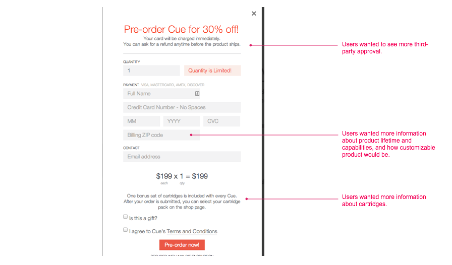
| Users who wanted to see more “third party” presence on the site endorsing Cue: | 2 / 13 users |
Direct User Suggestions
| Suggestion | Frequency |
|---|---|
| Shorten the introductory video on the home page | 4 / 13 users |
| Use different button sizes and less involved interface (i.e., no need to have a sidebar presentation or access FAQ for basic questions): | 6 / 13 users |
| Provide a more prominent definition of the Cue product “spelled-out” on the homescreen: | 5 / 13 users |
Visualize
annotated screenshots
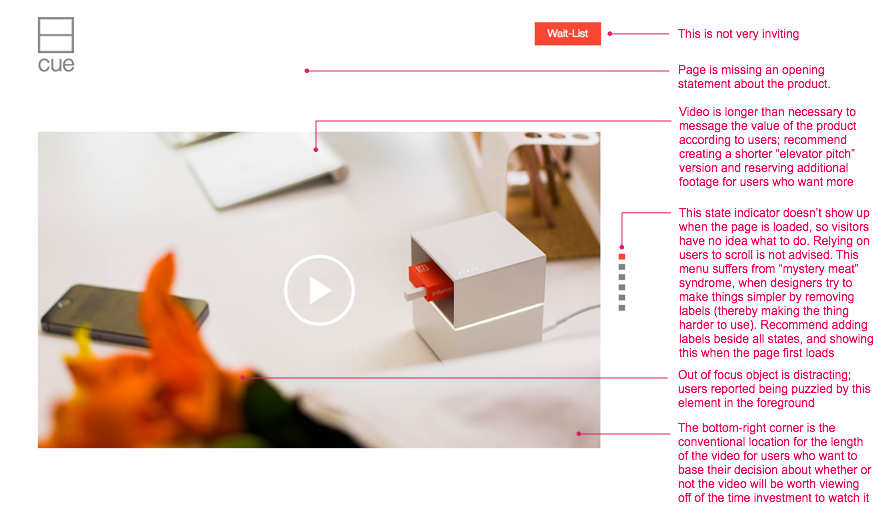
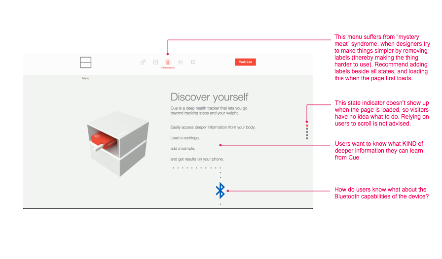
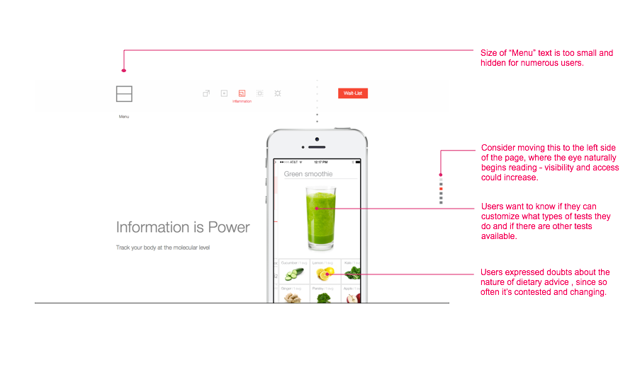
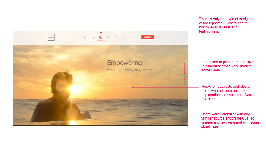
The below are annotations intended to represent the user feedback received in a more direct way by applying user comments to the areas they are describing.
Succeed
conclusions
Color / Design Style
One of the few areas that appealed to essentially every tester. The site’s overall look and presentation was praised as being clear, clean, concise, and beautiful . The relative simplicity and uncluttered nature the site projected appealed across the board.
Button Size / Menu Structure
Tests 9, 10, and 13 mentioned issues surrounding the menu button which kind of “blended” with the rest of the website. Testers suggested that it could be bigger, and a little bit more “obvious” in its placement, size, and coloration.
Test 10 commented on the movement of the menus - that it was rather blocky and not as customizable as he would have preferred, with an entire screen seeming to shift at once and with one click drastically changing the user’s perspective on the site.
Introductory Video
Tests 3, 6, and 12 made suggestions about the introductory video on the site. Test 3 opined that the “out of focus” elements in the foreground of the first frame are slightly distracting, and Test 6 had issues with the length of the video - he and Tester 12 were not as engaged with the video. Testers 6 and 13 felt that there could have been a more direct method of communicating the product name and purpose in the first parts of the video immediately. Testers 6, 12, and 13 lost interest in the video and moved away from it without finishing, and Tester 1 opined directly that it could have been shorter.
Product Comprehension
In contrast to the near-universal enjoyment of the site’s presentation, the subject of user comprehension of the Cue product was the area with the greatest difficulties. Most every tester gathered the name of the product, but when asked what the product did a much wider variety of answers was given. There can be a variety of reasons for this - some unrelated to the test and circumstantial. Some, like Testers 3 and 12, were already involved in the healthcare field or had kids and so had an almost inherent interest in the product because of its applicability to their lives.
The amount that a tester gleaned from the site varied with how interested and motivated the tester was to explore it. Ideally, the purpose of the site and the experience no matter what is to provide the most information and function to the user while requiring them to expend the least effort to arrive at such an outcome.
Testers 1, 2, 4, and 6 took a more “overhead” approach, not trying to dive in too deeply but gradually formulating an idea of what the Cue experience was about. Testers like 3, 5, 9, 11, and 13 were more investigative. not just content to know about a “healthcare” improvement device but wanting to figure out what those areas were and how the device accomplished that. To accomplish this, they frequently explored more areas of the site, consulted the FAQs, and viewed more menus and tabs to give themselves a comprehensive look at the individual areas of healthcare Cue focuses on.
pain points
Several times, users like Tester 3 and Tester 13 remarked that they wouldn’t necessarily want to use all of Cue’s functions and that they already were satisfied with their readings on certain tests. Or, they commented that the methods utilized on certain Cue readings would be unappealing or off-putting - such as a blood sample.
One of the most frequently mentioned issues was the area of cost. Naturally, people want to know how much something will cost. Although there is a price-listing of $199 on the Cue website that is fairly accessible when the “pre-order” is clicked, the more looming concern for people like Users 11, 13, 7 and 10 (among others) was the idea of how long the cartridge system would last. Once it was discovered that the $199 would not be a “one time fee” , testers wondered at how far their dollar would be going as it related to the use they would receive from the product. To add further confusion, the number of different test functions Cue performs led to questions about the pricing break-down per test, or if it would be less money or energy intensive if only certain tests were selected.
Testers 3 and 13 raised the issue of validation. A bit of a “chicken and egg” issue, new users of the product are going to want to see the praise and excitement of other satisfied users. They will want to read positive reviews, see words of praise, and find complimentary articles about what they are about to use. However, someone will need to go first in venturing to try the product.
prioritized ux recommendations
Priority 1
Priority 2
- More upfront third party validation (In the news, etc.)
Priority 3
- Include a direct discussion of the product name and purpose in the beginning of the video
Wireframe Visualizations
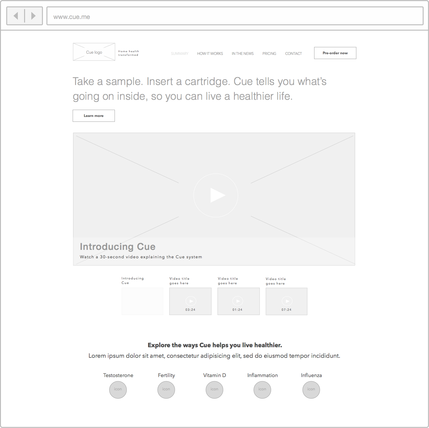
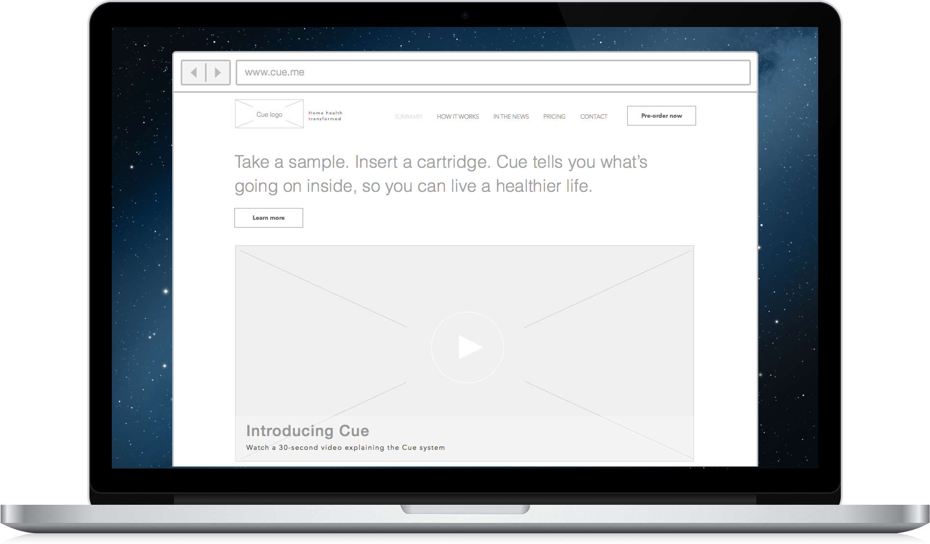
Home Page Redux
- Large, concise summary of Cue's value proposition is given highest home page priority
- Clear, site-wide navigation immediately readable at top of page when it loads
- Video contains a description and has been broken up into multiple sections
- Each section contains a short descriptive title and all include length of the video
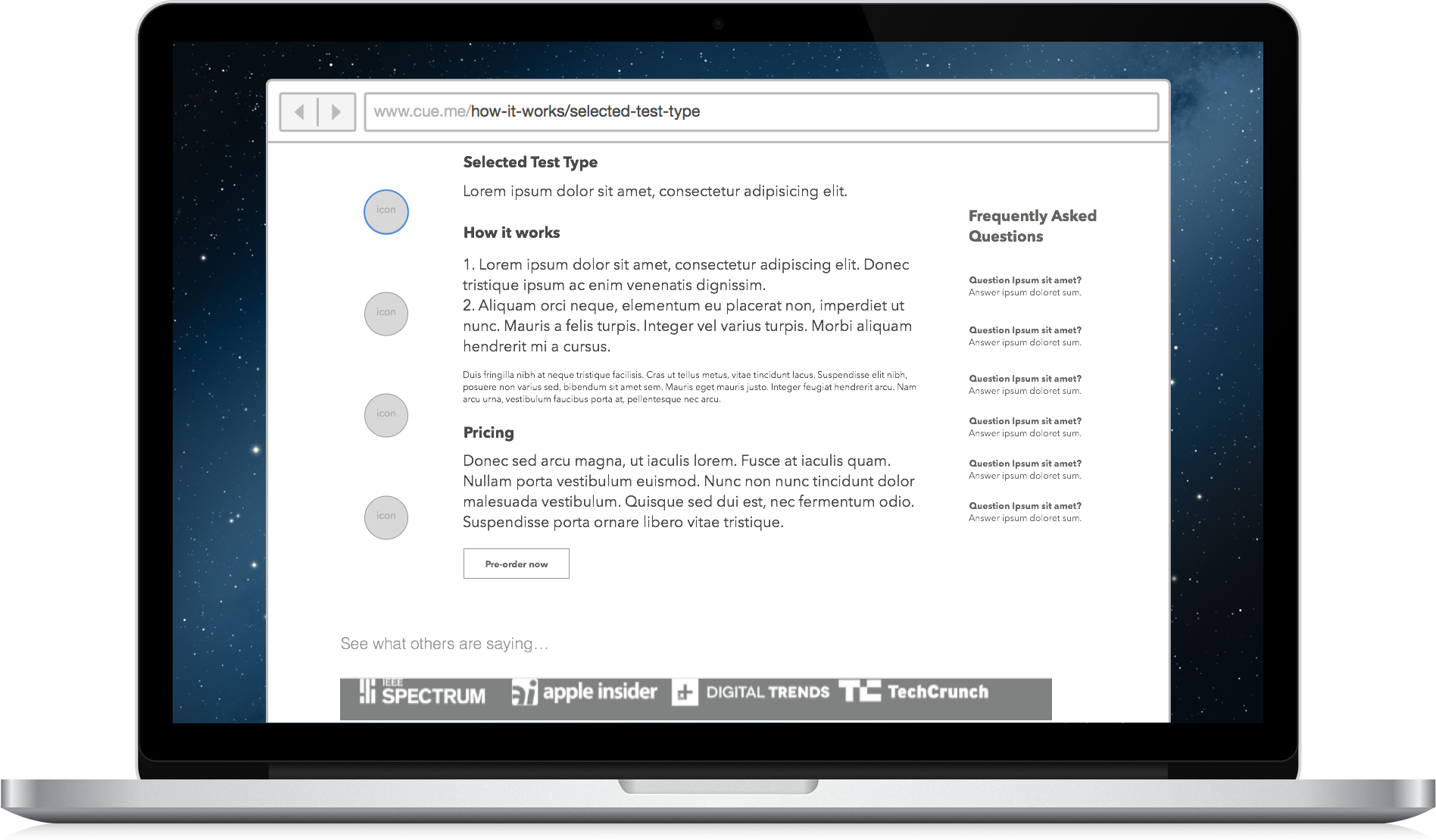
How It Works
Clarification & Expansion
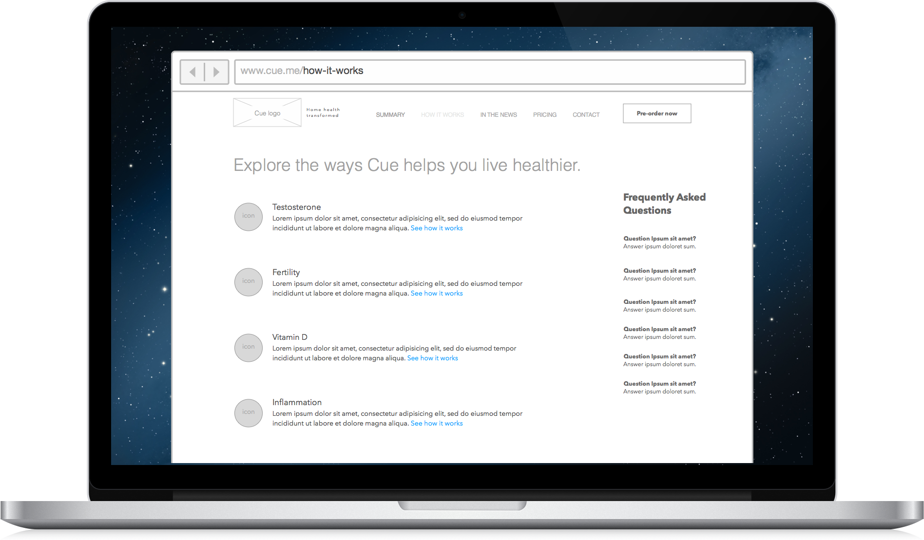
- A quick overview of each type of test (how the process works and est. annual cost) are given here
- Frequently Asked Questions are available immediately to the right of the main content area
- Once the user enters into a module page, that product page describes key details
Product Details Page
- Each page clearly states price per test kit and estimated annual cost to use Cue
- Options to purchase tests separately as well as information about cartridge and sample lifetime
- This is where the full specifics of using Cue are laid out plainly for the prospective customer
Click here to return to UX-Nick.com
Do you have questions about the usability of your website?
Just ask.©2014 UX-Nick.com. All rights reserved; please contact me if you would like to re-use any material.